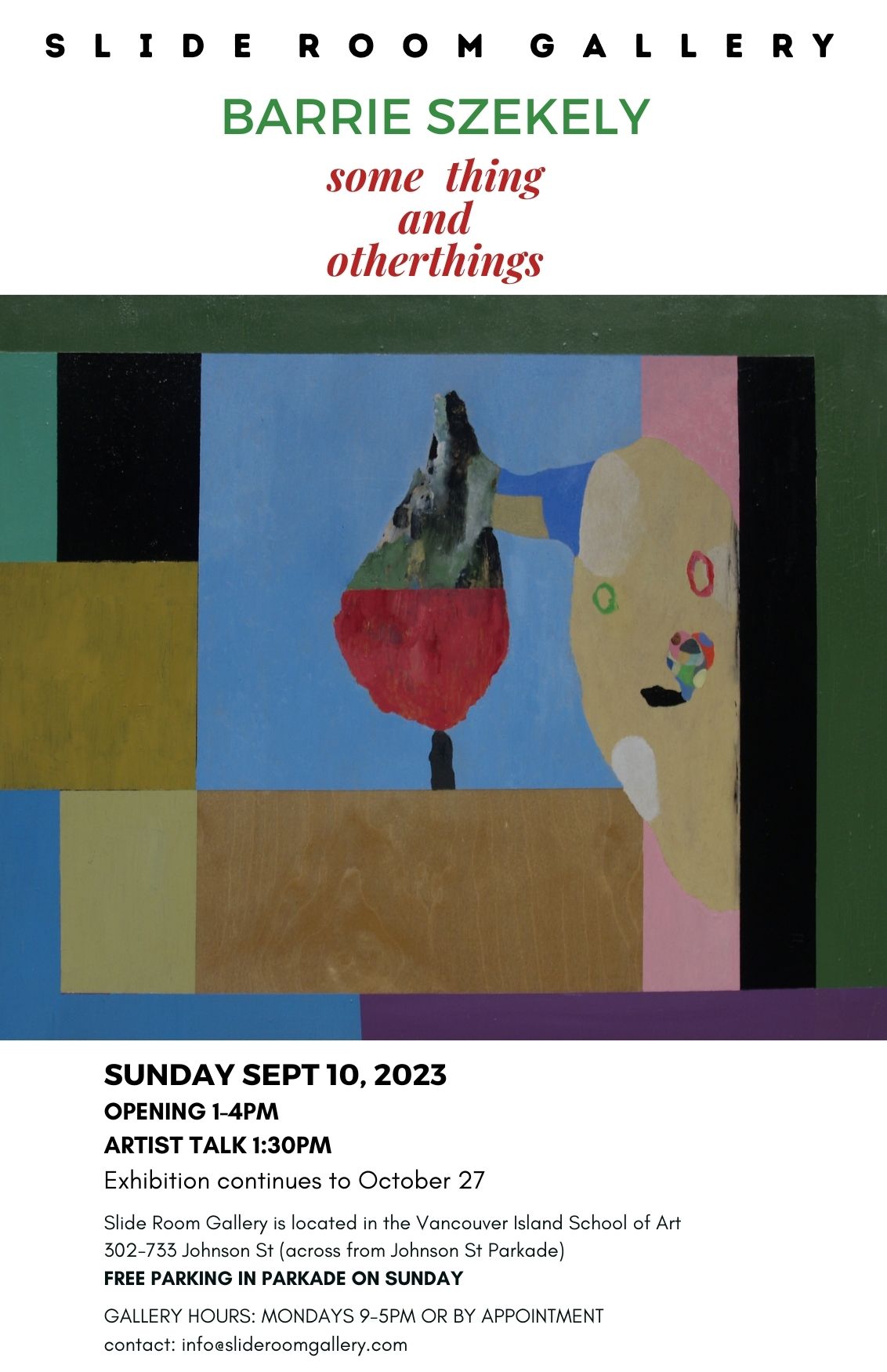
Barrie Szekely some thing and otherthings Opening Sunday, September 10 at 1pm Share this: Share on X (Opens in new window) X Share on Facebook (Opens in new window) Facebook Like Loading...
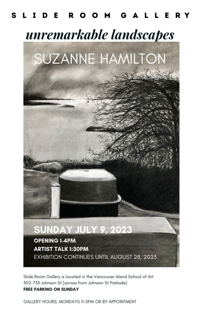
Suzanne Hamilton Unremarkable Landscapes Opening reception July 9, 1-4pm, Artist talk 1:30pm Share this: Share on X (Opens in new window) X Share on Facebook (Opens in new window) Facebook Like Loading...
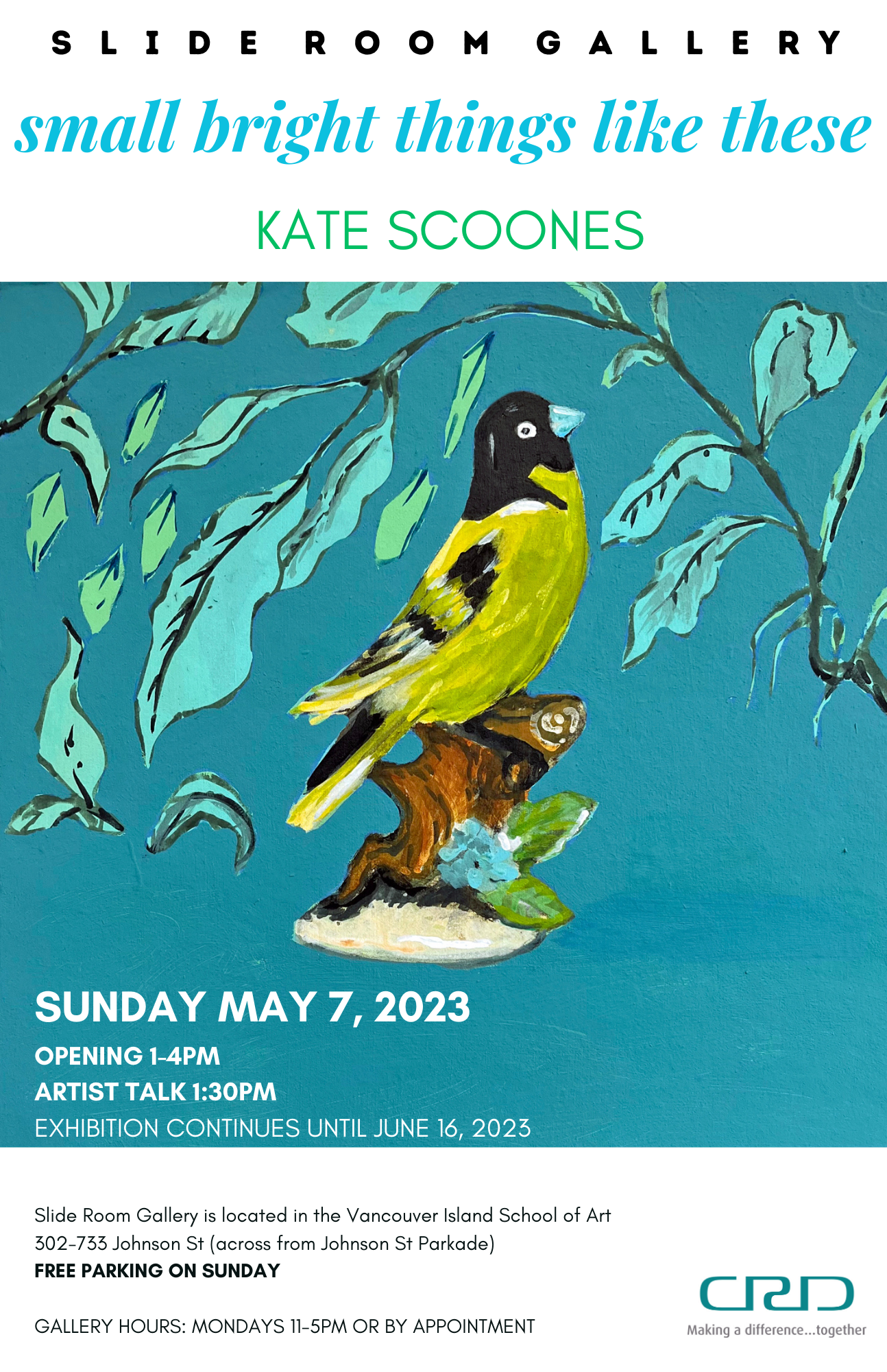
KATE SCOONES: small bright things like these Share this: Share on X (Opens in new window) X Share on Facebook (Opens in new window) Facebook Like Loading...
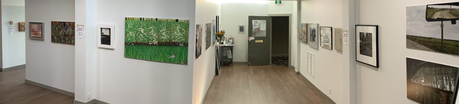
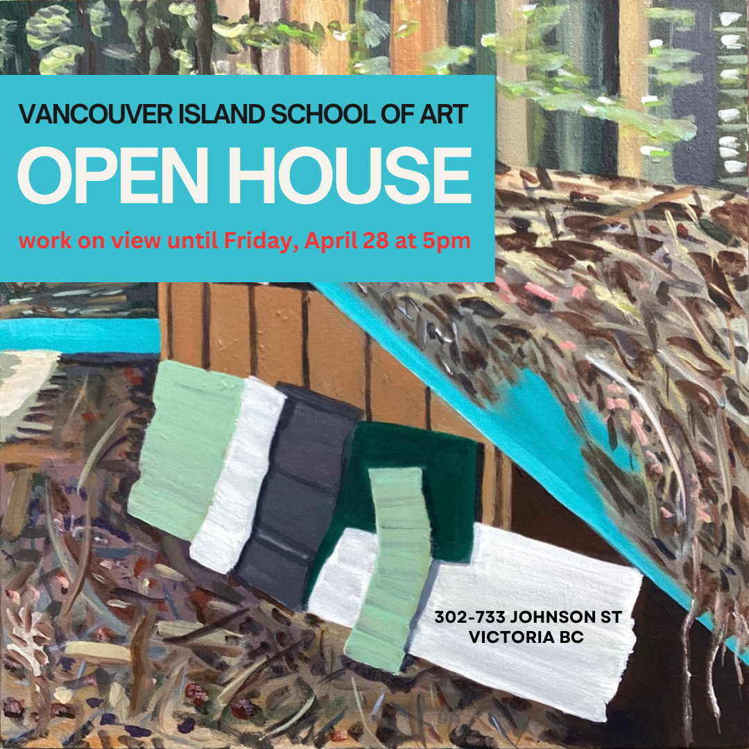
OPEN HOUSE Student work is on view until Friday, April 28 at 5pm Share this: Share on X (Opens in new window) X Share on Facebook (Opens in new window) Facebook Like Loading...